The Problem With Most Wellness Websites
The most common issue with wellness practice websites is not that they are ugly. It is that they are vague. They read like a mood board instead of a clear invitation. The homepage says something about holistic healing and the journey to wellness. There are soft gradients and stock photos of river stones. But nowhere on the page does it answer the three questions every first-time visitor is actually asking: What do you do? Can you help me specifically? How do I get started?
Visitors to your website are not browsing for inspiration. They are searching because something hurts, something is not working, or someone told them to look you up. They are evaluating you alongside two or three other practitioners whose websites they also have open in separate tabs. You have maybe fifteen seconds to convince them to stay, and another minute to convince them to act.
A website that converts treats every element as a step in that evaluation process. Nothing decorative without purpose. Nothing clever that sacrifices clarity.
Start With a Clear Value Statement Above the Fold
Above the fold means the portion of the page visible without scrolling. This is where most wellness websites waste their best real estate. A large background image with a practice name overlaid on it tells the visitor nothing they did not already know.
Instead, the first thing a visitor should see is a clear statement of who you help and what outcome they can expect. This is not a tagline or a brand slogan. It is a plain sentence that answers the visitor's core question: is this for me?
A chiropractor might write: "Relief from chronic back pain through evidence-based chiropractic care in downtown Portland." A massage therapist might use: "Deep tissue and sports massage for active professionals recovering from injury or managing daily tension." A therapist might lead with: "Individual therapy for adults navigating anxiety, burnout, and major life transitions."
Notice what these have in common. They name the type of person being served. They name the problem or outcome. They include a concrete detail that grounds the promise, whether that is a modality, a location, or a population. The visitor reads it and immediately knows whether to keep going or close the tab. Both outcomes are good for you. Attracting the wrong clients costs more than losing them early.
Make Your Services Page Do the Heavy Lifting
Many wellness websites have a services page that reads like a restaurant menu with no descriptions. Acupuncture. Cupping. Herbal medicine. Initial consultation. Follow-up. The practitioner knows what each of these means and assumes the visitor does too. They do not.
Your services page should be the most detailed, most carefully written page on your website. Each service needs three things: a short description of what happens during the session, who it is best suited for, and the price. Leaving out any of these creates friction that kills conversions.
The description does not need to be long, but it should be specific enough that a first-time client knows what to expect. "During a 60-minute deep tissue session, I work through layers of muscle tension using sustained pressure and slow strokes. Most clients come in for chronic tightness in the neck, shoulders, and lower back." That is more useful than "Deep Tissue Massage — 60 min."
Pricing transparency matters more than most practitioners think. Many avoid listing prices because they worry about sticker shock or because their rates vary. But hiding the price does not prevent sticker shock. It just delays it until the client calls, feels awkward, and hangs up. Worse, it adds a step to the booking process. Every step you add between interest and action is a place where you lose people.
If your pricing genuinely varies, list a starting rate or a range. "Initial consultation: $150–$200 depending on complexity" is infinitely better than "Contact us for pricing."
The Book Now Button Needs to Be Everywhere
One of the simplest and most effective changes you can make to your website is adding a clear call to action on every page. Not just on the contact page. Not just in the navigation. On every page, ideally visible without scrolling.
This sounds aggressive, but it is not. A "Book Now" button does not feel pushy when the rest of the page has earned the visitor's trust through clear information. It feels like a natural next step. What does feel frustrating is a visitor who has decided they want to try you and then has to hunt through your site to figure out how to actually schedule.
The button should link directly to your booking page or online scheduler. If you use an intake form, the booking flow should be the entry point, not a separate contact form that requires a phone call before anything happens. Every manual step you insert between the visitor's decision and their confirmed appointment is a conversion you are leaving on the table.
Build Trust Before You Ask for the Booking
Visitors do not book because your website is pretty. They book because they trust you enough to show up. Trust on a website comes from a combination of signals, none of which require expensive design.
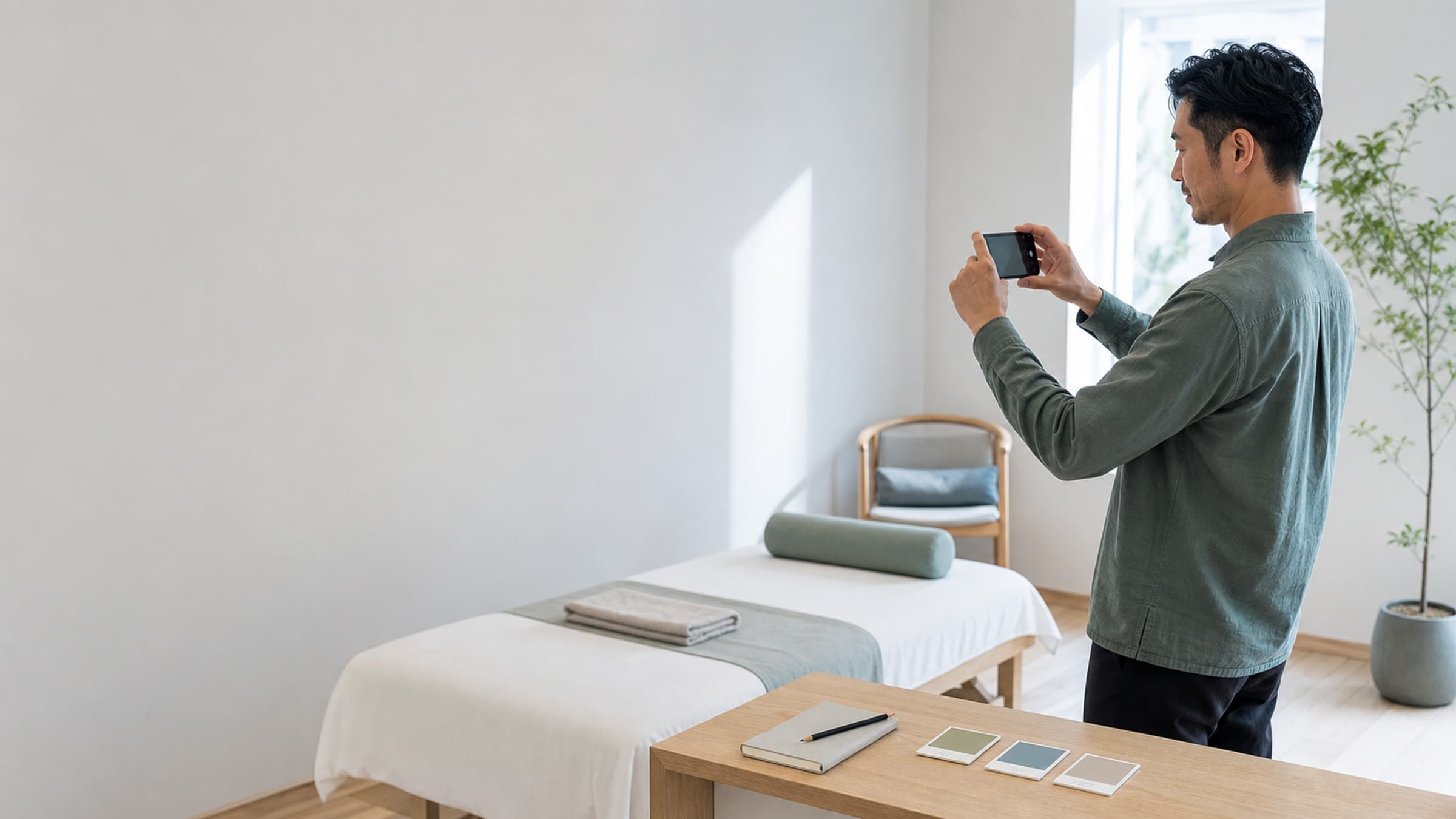
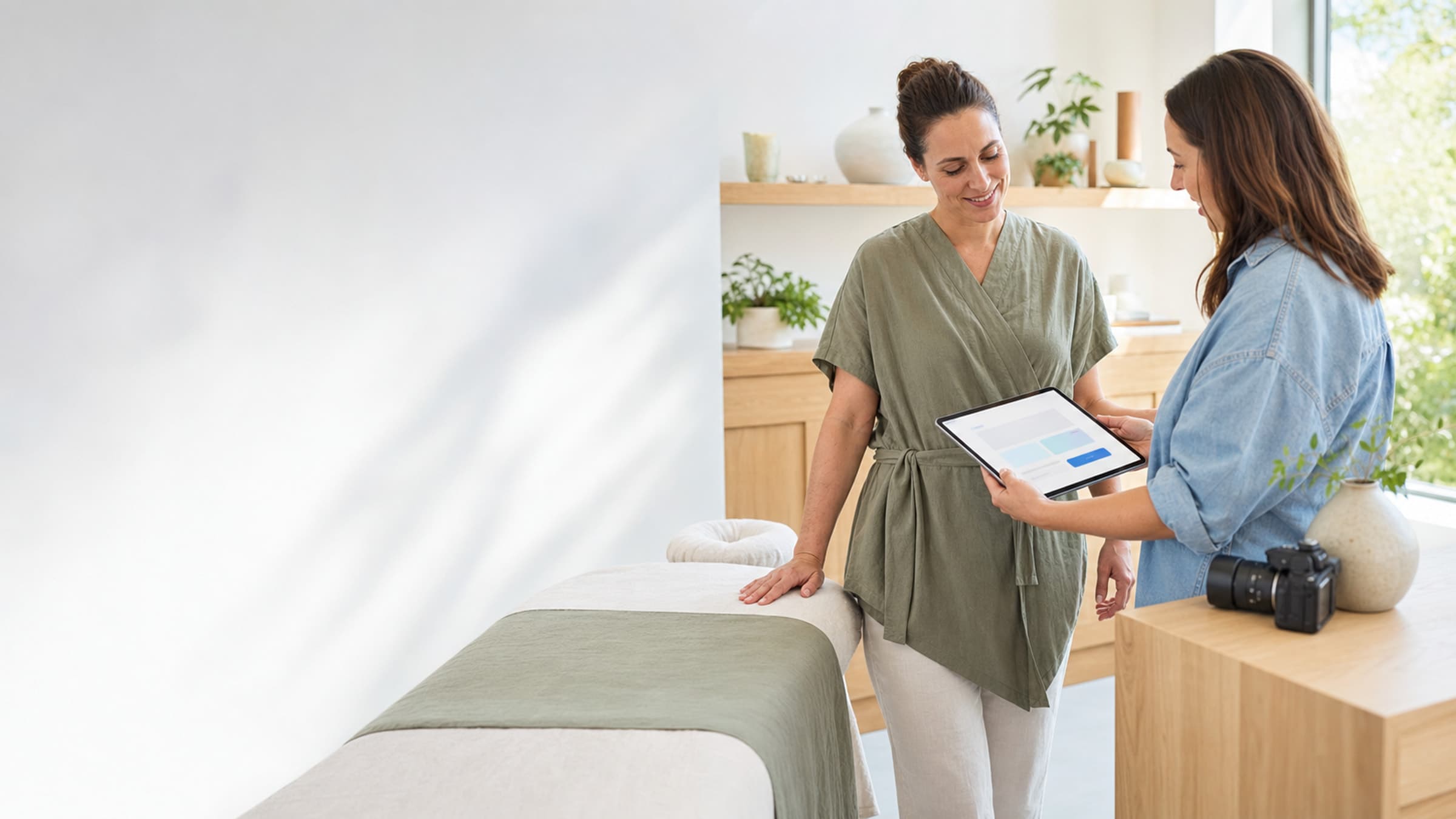
The first trust signal is your photo. A real, professional, warm photo of you in your practice space. Not a stock photo. Not a logo. People want to see who they are going to be in a room with. This is especially true in wellness, where the service is intimate and the relationship matters. If you work with a team, show the team. If you have a treatment room that feels welcoming, show it.
The second trust signal is credentials. Where you trained, what certifications you hold, how many years you have been practicing. Keep this concise but visible, ideally on the homepage and on your about page. Visitors do not need your full CV. They need enough to feel confident that you know what you are doing.
The third trust signal is social proof. Client testimonials and reviews are the most powerful conversion tool on any wellness website, and they are almost always underused. A single testimonial block near the bottom of the homepage is not enough. Sprinkle relevant testimonials throughout your site, near the services they relate to. A testimonial about your acupuncture work belongs on the acupuncture service description, not in a generic carousel.
If you do not have testimonials yet, ask for them. Most happy clients are willing to write a sentence or two. Make it easy by sending a follow-up email after a few sessions with a simple prompt: "If you've found our work together helpful, I'd love a sentence or two I can share on my website. No pressure at all."
Your About Page Is a Conversion Page
Most practitioners treat their about page as a biography. Where they grew up, when they discovered their calling, a paragraph about their philosophy. This is understandable. Your story matters. But an about page on a wellness website is not really about you. It is about reassuring the visitor that you are the right person to help them.
The most effective about pages lead with the client's experience, not the practitioner's resume. Start with what it feels like to work with you, then explain why you are qualified to deliver that experience. The structure might be: a short opening about the kinds of people you work with and what they can expect, followed by your training and background, followed by a personal detail or two that makes you human rather than clinical.
The about page should also have a call to action at the bottom. The visitor who read your entire about page is already interested. Give them the next step immediately, not a dead end that forces them to navigate somewhere else.
Speed and Mobile Experience Are Non-Negotiable
More than half of your website visitors are on their phone. If your site takes more than three seconds to load on mobile, you are losing a significant percentage of potential clients before they even see your content. If the text is too small to read without zooming, or the booking button is hard to tap, or the navigation menu does not work well on a smaller screen, the same thing happens.
Test your website on your own phone regularly. Try to book an appointment as if you were a first-time visitor. If any step feels clunky, slow, or confusing, fix it before working on anything else. A fast, clean mobile experience converts better than a gorgeous desktop site that falls apart on a phone screen.
Page speed also affects your search engine rankings. Google prioritizes fast-loading pages, which means a slow website is not just frustrating visitors who find you. It is preventing new visitors from finding you at all.
Write Like a Human, Not a Brochure
Wellness websites have a tone problem. Many of them read like they were written by a committee trying to sound professional and soothing at the same time. The result is language that is technically correct but emotionally flat. "We are committed to providing a holistic approach to your well-being in a nurturing environment." That sentence says nothing. It could appear on any wellness website in the country and no one would notice.
Write your website copy the way you would talk to a prospective client at a networking event. Direct, warm, specific. If you specialize in helping new mothers with postpartum anxiety, say that plainly. If your approach is more clinical than spiritual, let that come through in the language. The practitioners who convert best from their websites are the ones whose personality is visible on the page. Visitors are not just choosing a service. They are choosing a person.
Read your website copy out loud. If it sounds like something you would never actually say to a client, rewrite it until it does.
Do Not Bury Your Contact Information
This seems obvious, but it is startlingly common. Wellness websites where the phone number is only on the contact page. Where the email address is hidden behind a form. Where the physical address requires clicking through to a Google Maps embed. Every piece of contact information should be immediately accessible, ideally in the header or footer of every page.
Your address matters even if most of your clients book online. It signals that you are a real business in a real location. Your phone number matters even if most communication happens over email. Some clients, particularly older ones or those seeking a specific kind of care, will call before they book. Make it easy for them.
If you offer virtual sessions, say so clearly and make the geographic reach obvious. "Virtual sessions available throughout California" is more useful than just "telehealth available."
Track What Is Working
A website that converts is not a set-it-and-forget-it project. You need to know what is happening on your site to make informed improvements. At minimum, set up a free analytics tool that shows you how many visitors your site gets, which pages they visit, how long they stay, and where they leave.
Pay attention to the pages with high traffic but low engagement. If your services page gets a lot of views but few people click through to book, the problem is probably on that page. Maybe the pricing is unclear, or the call to action is not visible, or the descriptions do not answer the right questions.
Small changes can have outsized effects. Moving a booking button higher on a page, adding a testimonial near a service description, or rewriting a vague headline to be more specific can each independently increase your conversion rate. But you will only know what to change if you are watching the data.
A Website Is a Living Thing
The best wellness practice websites are not the ones that launch with the most polish. They are the ones that get updated, tested, and refined over time. Add a new testimonial when a client says something you are proud of. Update your services page when you introduce a new offering. Swap out your headshot when it no longer looks like you.
Your website is not a brochure you print once and distribute. It is the front door to your practice, and it is open every hour of every day. Every visitor who lands on it is a potential client weighing their options. The question is not whether your website is good enough. The question is whether it makes the next step obvious enough that a stranger with a problem can go from curious to booked in under two minutes.
That is the bar. And with clear copy, visible calls to action, real trust signals, and a fast mobile experience, it is a bar that every practitioner can clear.