Begin with the room you already welcome people into
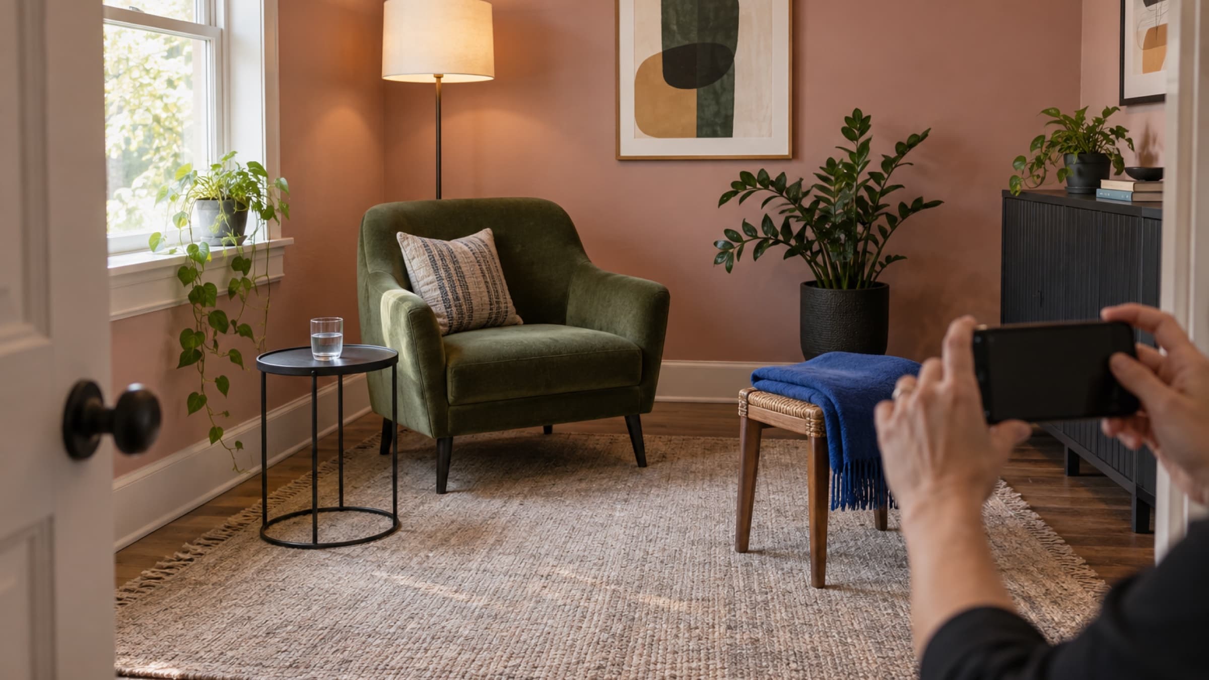
Before you open a colour picker, look at your real practice.
Notice the colours that are already doing useful work. You might have a deep blue treatment table, a rust-coloured chair, charcoal towels, warm white walls, or a bright piece of art near reception. The goal is not to copy the whole room onto your website. It is to find one signal that already feels natural in your work.
If you see clients online, look at the background they see on video, the clothes you tend to wear for sessions, and the materials you use in handouts or follow-up emails. Your practice still has a visual character even without a physical clinic.
Take two or three photos in ordinary daylight. Put them side by side and ask:
- Which colour appears more than once?
- Which colour feels deliberate rather than accidental?
- Which detail would you be happy to keep for the next few years?
- What looks welcoming without becoming decorative noise?
Choose one answer as your starting colour. You are not choosing the entire website yet.
Name the feeling before you choose the shade
Words are easier to judge than endless swatches.
Pick two words that describe how you want a new client to feel when they arrive on your site. Keep them grounded in the experience you actually provide. You might choose clear and steady, warm and capable, bright and practical, or quiet and focused.
Avoid asking one colour to communicate a long list of ideas. A palette that is meant to feel calm, luxurious, clinical, earthy, creative, inclusive, bold, and timeless will have no clear direction.
Your two words give you a simple test. If a colour is attractive but makes the page feel playful when you need it to feel focused, it is not the right choice for this job. You can still like it. You just do not need to build the site around it.
It also helps to name what you do not want. If your treatment room already has plenty of beige and pale wood, you may want the website to bring in more contrast. If your practice works with children and families, you may want warmth without making the page look like a toy shop.
Choose one main colour, not six favourites
Your main colour should be easy to recognize and useful in small amounts. It may appear on buttons, links, selected states, or simple accents. It does not need to cover every surface.
Start with a shade that still looks clear beside both very light and very dark neutrals. Then let white, cream, charcoal, or another quiet neutral carry most of the page. This gives photographs, service names, prices, and booking actions room to breathe.
Be careful with very pale colours as the only brand signal. A dusty pink or soft sage may look lovely as a background but disappear when used for a button or link. You can keep the pale version for larger areas and use a deeper relative for actions.
Also watch highly saturated colours. They can be effective in a small button and tiring across a full page. Test the colour where it will actually appear before deciding it is too loud or too dull.
Decide how the supporting colours should relate
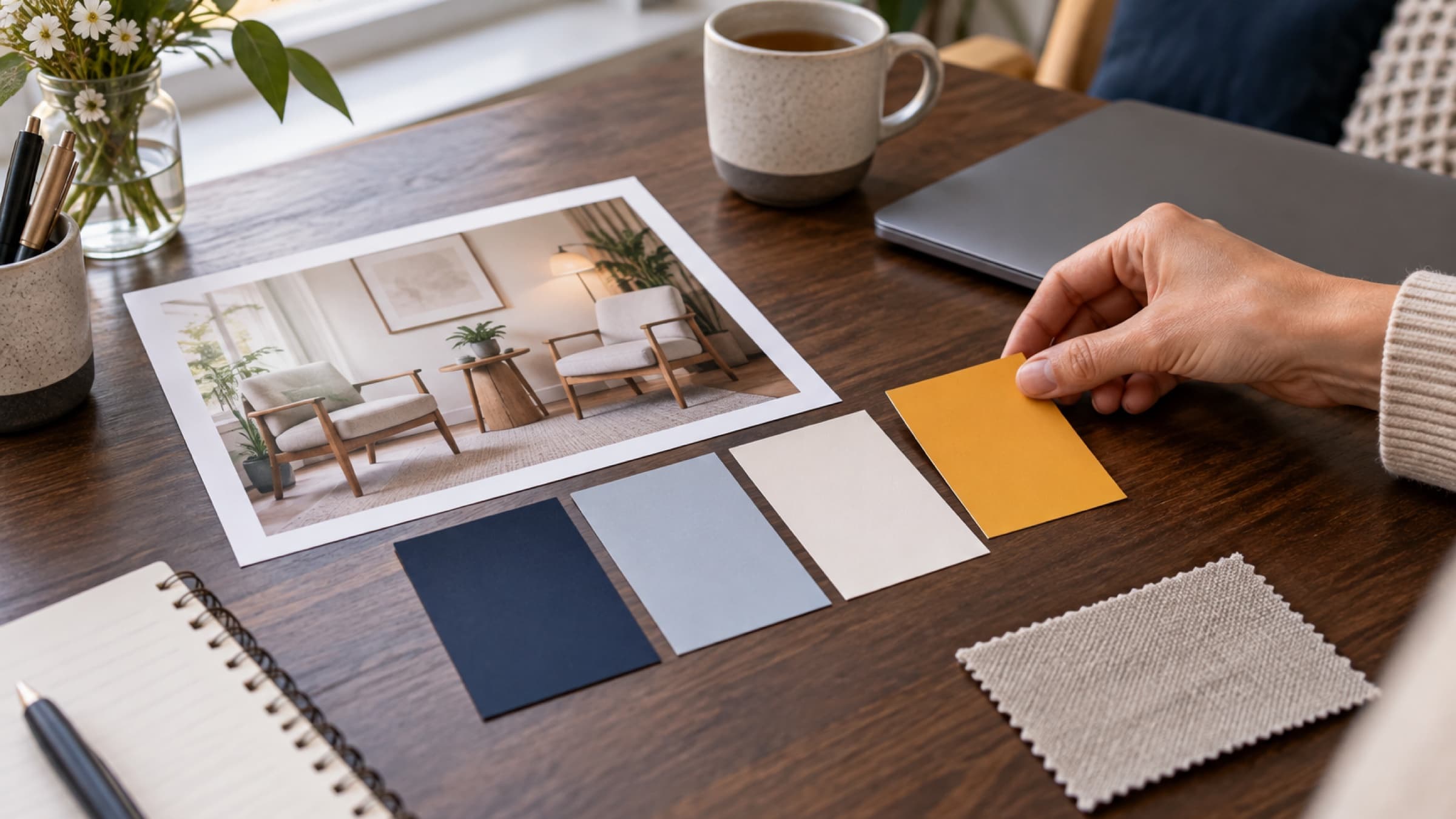
Once you have a main colour, choose a relationship for the rest of the palette. You do not need to become a colour theory expert. A few common structures are enough:
- Monochromatic uses lighter and deeper versions of one colour. It tends to feel calm and cohesive.
- Analogous adds neighbouring colours from the colour wheel. It can feel natural and gentle.
- Complementary pairs the main colour with its opposite. It creates stronger contrast and needs a little restraint.
- Split complementary uses colours on either side of the opposite. It adds energy without relying on one direct contrast.
- Triadic uses three colours spaced around the wheel. It can feel lively when one colour leads and the others stay secondary.
Choose the relationship that supports your two feeling words. A quiet counselling practice may prefer a monochromatic or analogous direction. A movement studio might use a complementary or triadic direction to add more energy. These are starting points, not rules about what a kind of practice should look like.
Keep the roles clear. One colour should lead. The others should support backgrounds, small accents, or illustrations. When every colour demands equal attention, the client has to work harder to find the next step.
Test the palette with real website content
A row of colour chips can look balanced while the finished page feels awkward.
Put the colours onto a realistic section of your site. Use your actual practice name, a real service title, a short description, a price if you publish one, and a booking button. Add one of the photographs you plan to use.
Then check:
- Can you read the heading and body copy without effort?
- Does the main action look like the obvious next step?
- Do links look different from ordinary text?
- Does the photograph still feel like it belongs?
- Does the page work in bright daylight on a phone?
- Does a dark version still feel like the same practice, if you plan to offer one?
Do not judge only from a large desktop monitor. A subtle colour difference can disappear on a smaller screen, and a large block of colour can become much more dominant when the layout stacks.
Ask one person to look at the page for five seconds, then tell you what they think they should do next. Their answer will teach you more than asking whether they like the palette.
Use a stopping rule
Colour choices become exhausting when every option stays open.
Give yourself a short stopping rule. For example: choose one main colour, compare three relationships, test the two strongest on a real page, and publish the clearer one.
Do not keep changing a shade because a different screen makes it look slightly warmer. Screens vary. Aim for a reliable overall relationship, readable text, and a clear action rather than a single perfect appearance everywhere.
After you publish, leave the palette alone for a month unless something is genuinely hard to read or use. Let clients experience the site. Notice whether the colours support the photographs, services, and booking flow. You can make a measured change later with better information.
Consistency will do more for your brand than constant refinement. Use the same main colour and supporting relationships across your website, booking page, simple social graphics, and email headers. You do not need every item to match exactly. You need them to feel like they came from the same practice.
Choose a system you can keep using
A useful website palette is not the most original one. It is the one that feels connected to your real practice, keeps the page readable, and makes the next step clear.
Start with what is already around you. Name the feeling you want. Choose one main colour, give the supporting colours clear roles, and test them with real content before you publish.
Stillpoint's website setup lets you choose how your homepage opens, the lettering and shapes that fit your practice, then a main colour and the way the other colours relate to it. You can watch the result in a live preview and change the colours later, so the first choice does not have to carry forever. Explore Stillpoint's website tools.